Here's how to create responsive elearning - or mobile-ready elearning content. Gone are the days where people were stuck at their desks trying to complete long and tedious elearning courses in one sitting.
Who uses reponsive eLearning?
In late 2016, research by Statcounter showed that more websites were loaded on smartphones and tablets than on desktop or laptop computers for the first time ever. This milestone is especially significant when you consider that in 2010, mobile devices accounted for only 5% of the total page loads.
Responsiveness - provision of an optimal viewing experience across a wide range of devices - is no longer a luxury, it must be a core part of your design process. It is increasingly common for learners to complete courses on mobile devices, plus they expect to be able to switch from desktop to mobile if they want to revisit information when they are not at their desks.
Logicearth have been crafting fully responsive eLearning since 2010. In this blog, I would like to offer some advice for creating responsive content, plus links to a couple of handy free tools I use to do it.
Scrolling is the way to go for responsive eLearning
Scrolling-based eLearning is better for responsive design than the more traditional “click next” format.
On smaller displays traditional formats tend to scale down proportionally, leaving on-screen text very small and often illegible. With a scrolling format text is free to reflow, meaning that the type can remain at a size which is comfortable for users to read.
Content that is arranged in columns will also shrink on “click next” learning, on scrolling courses the columns can stack vertically to maintain a sensible width.
We actually prefer scrolling courses even for desktop. We believe they are more engaging and allow greater creative freedom for designers. Users have become accustomed to scrolling on websites and social media, so why not build their eLearning in the same way?
Our Content development services make it easy for your staff to access learning on any device
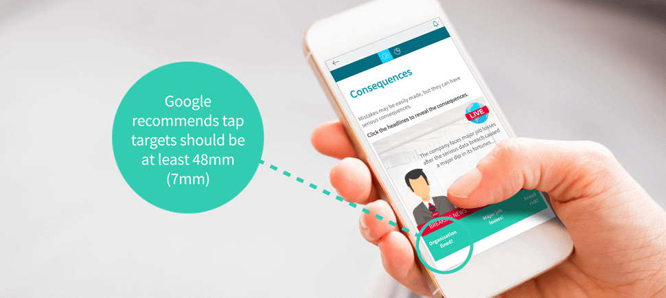
Fingertips are not pinpoint accurate
On desktop we can click or drag the smallest elements using the tiny and accurate mouse cursor. On mobile this is not the case. Clicks become a tap or drag of the finger, and the area which we can reliably interact with becomes much larger.
Google recommend that tap targets are at least 7mm (or 48 pixels) so that the average 10mm fingertip will not accidentally trigger two targets at once.
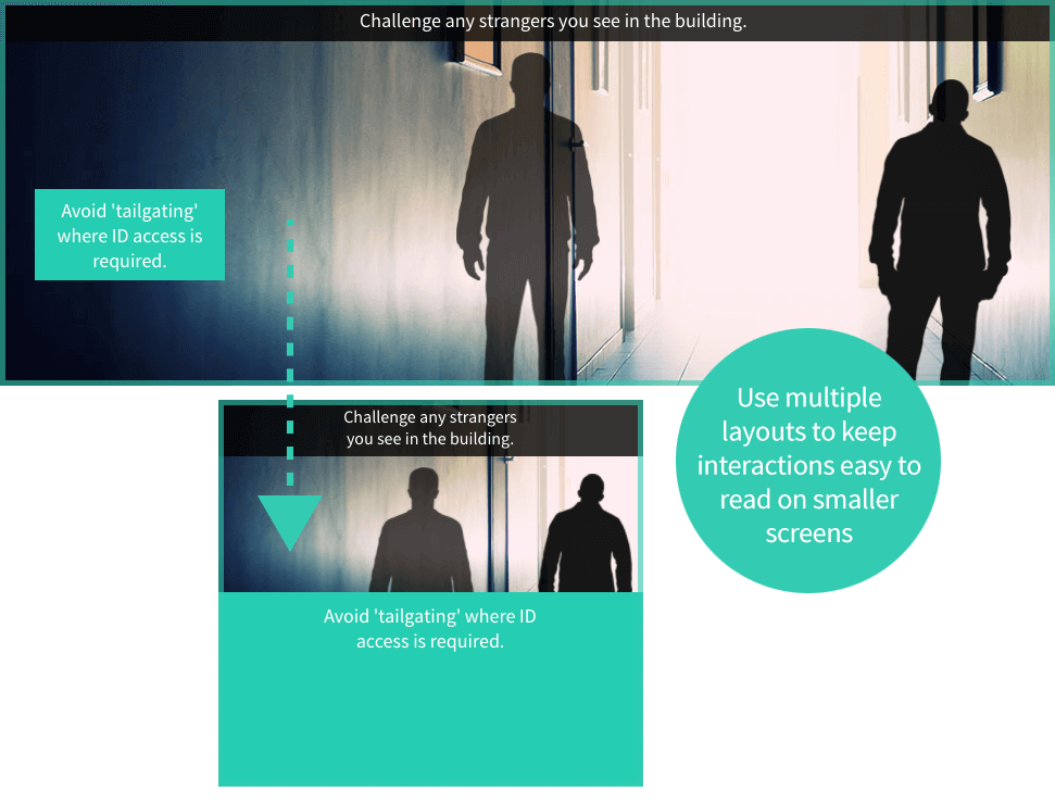
Adapt your interactions for responsive eLearning
We like to bring or courses to life with bespoke interactions, and these must scale down for smaller displays.
We will either scale the interaction proportionally or have multiple layouts for different screen sizes. If an interaction has more than a few words of text, multiple layouts are better. Interactions that are mostly graphical can be scaled to fit, again just make sure your tap targets are big enough.
This example eLearning content is taken from our Compliance solutions catalogue
Test on different devices
Devices come in many shapes and sizes, and the aim is make your content work seamlessly on as many as possible. During development, there are browser tools you can use to artificially test your content on different devices. I use Viewport Resizer, a bookmark extension for Chrome, which allows you to quickly preview the most popular mobile sizes.
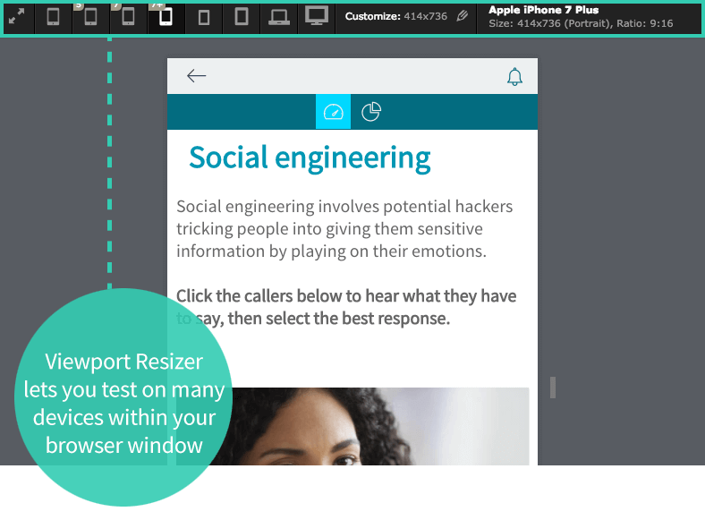
You can download Viewport Resizer for free
When your eLearning is ready for launch, I recommend testing the user experience on as many mobile devices as you can get your hands on. We test on several smartphones and tablets on both iOS (Apple’s standard mobile operating system) and Android (the operating system used by most other brands including Google and Samsung).
Squeeze every image
Mobile users are often using slower internet connections like 3G so reducing download time is important. Make sure all images are the right dimensions and optimised for web.
I use tinypng, a web-based image compression tool, to squeeze all images. It slashes the file size of images dramatically with no visible loss of quality.

Some authoring tools, like Evolve from Appitierre, give you the option to supply alternative images for mobile viewing which allows you to further optimise your content.

Get a demo of responsive eLearning
If making it easy for your staff to access learning in the exact format they need would help your business, take look at our responsive eLearning content and our Compliance solutions.


Was this article helpful?