Experimenting with colours and textures is an innate human ability, as our Neanderthal forefathers used a variety of pigments from coal to red and yellow ochre extracted from plants in order to create animal forms. So saying artists are born not made can be challenged! We definitely have come a long way in terms of advanced visual literacy from our ancient predecessors. Here's ow to improve your design skills, especially if you aren't a trained graphic designer.
Why are visual design skills important?
We live in a more visual society than ever, yet design literacy lags behind most other skills. What are the pitfalls of bad design? What are the simple steps you can take to improve your visual design skills and visual literacy? You will find the answers to these questions in our list below. We explain design essentials for a better understanding of what makes visually engaging content.
1. Creative sparks
Inspiration can be derived from the smallest of things in life. Water lilies inspired Monet, while the irregularities and unfairness of life inspired Van Gogh to paint in such exaggerated and intense strokes. You can broaden your horizons by studying books on not only visual literacy, but anything that gets your creative juices flowing. The peculiar thing about inspiration is that it often strikes you at the most unexpected hours, so keep your pen and paper ready at all times to jot down the ideas and draw images to support them, and build upon those ideas by adding details later on.
2. Negative and positive space
Balanced negative and positive spaces make the eye travel to the object of attention with ease. Negative space is the background, while positive space is the foreground if you are working on a bi-layered design layout. A very busy negative space may cause fatigue to the eyes and may divert the viewers’ attention from the primary subject of your content. You can create an illusion of a third dimension and depth on a two dimensional surface by overlapping, shading, highlighting and shadowing, building up on linear and atmospheric perspective by changing how air and fog perceive distant objects. For example, for a kids’ website, a negative space that is fluid and without any block images is preferable for easy eye movement.
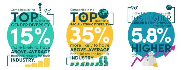
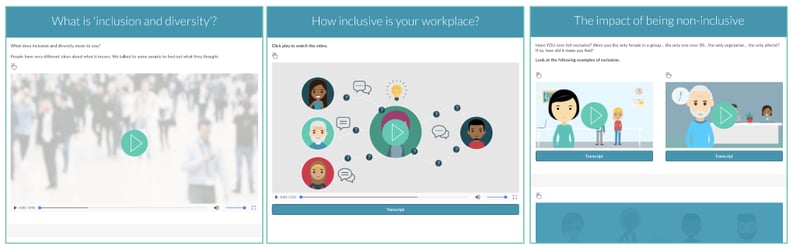
We created the infographic shown above for our free Inclusion and Diversity compliance course
The numbers in white - in contrast to the background - is a good balance of positive and negative space

3. The colour scheme
Color psychology plays a pivotal role in brand selling and retaining a wide client base. Picking a colour is not an easy task, as many options seem to work together just fine, so it is important that you make several colour layouts that you think represent the philosophy behind your brand sufficiently. You may have noticed that food brands usually range from hues of yellow to oranges and reds, while social media sites are predominantly blue, like Facebook, Tumblr, Instagram, Twitter, and Skype. Know your target market, and then proceed accordingly with your colour scheme. To create a strong colour palate for the visual content, Adobe Kuler colour wheel tool will help you create shades and find complementary colours with ease.
A colourful scheme in one of our eLearning courses, which
reflects the brand of our client in the ICT sector - eir
4. Textures in design
Textures in a design are used to create depth and warmth to the overall layout. In digital art, texture means the way a surface is perceived to feel, and can be added to gain or avoid attention for an element. Visual textures include adding the illusion of peaks and valleys, or adding lush leaves to a tree. Repeating a motif or a linear form throughout is also termed as adding texture. Texture can be used as a tool to harmonise negative and positive space as well. But make sure you don’t use too much of texture in your design because it creates a highly busy space and can put a strain on the eyes. Moreover, ensure that the focal point of your design is enhanced, and not diminished by adding a certain texture.

Textures are often useful for backgrounds to help emphasise text in the
foreground and to reinforce an particular message
5. Harmony in designs
After you are done with your form, space, colours, and texture, focus on the balance and harmony of your layout. Do you feel your design appears heavier on one end and lighter on the other? Or you think the base of your design is not wide enough to support heavy motifs on top? These details need to be addressed accordingly if a visually appealing design is to be created. Achieving visual unity is the main goal in graphic designing, and all elements need to be in agreement. Pay special attention to the perspective, continuation, repetition, and rhythm to create a unified design. This doesn’t mean your designs should always be strictly symmetrical, as asymmetrical designs can also be a way to strike an informal balance in a layout. Think order in chaos.
A scenario design from one of our eLearning courses - shows a harmonious
blend of colours and balanced negative and positive space.
6. Design hierarchy
Hierarchy guides the eye movement of the viewer. It gives you the power to make viewers look at one place, and then guide their eyes to fall on the next. This can be achieved by various methods including using complementary colours, fluid negative space, and interactive foreground. For example, for a kids’ website, you can form a hierarchy in your text by using a specific font for a specific subject. You can also achieve this by using particular colours.
It is easy to see which information is most important here. Without even reading the instructions , I can quickly figure out what I need to do. That is the hallmark of good design. Design hierarchy is an important part of user experience design (UX).
7. Scale and proportion
Scale and proportion are significant in keeping the balance and harmony of your design. Make sure that the forms, motifs, and texts in your design don’t downplay the importance of your focal point.This is because using the relative size of elements against each other can attract attention to a focal point. When it comes to scale, if elements are designed larger than life or incredibly diminished, scale is being used to show drama. Disproportionate designs and misplaced elements put off the viewer. Also, it is a rookie mistake to not follow the scale and proportion guidelines. You can enhance your understanding of scale and proportion by drawing design elements and forms manually on a paper. Moreover, studying and understanding the golden ratio may also prove to be helpful in this regard.
The larger than life elements of this design are being used
to make an important learning point in one of our eLearning courses.
8. Dominance and emphasis
Ideally, every design should have a key area of interest or focal point that assists as a way into the design. Moving along from this primary dominant design element, a layout flow can be achieved by creating elements with secondary and tertiary dominance. Dominance of a focal point depends on contrast, as without contrast everything would be identical. The absence of dominance between elements leads to competition between them. If there are three yellow squares of equal size in your design, which one should the viewer look at first? It takes away the chance of an interactive communication between the viewer and your design.
The green highlight dominates when you are reading one section,
with the other sections remaining the same colour
9. Using similarity and contrast creatively
Developing a consistent and similar design is a vital facet of a designer's job to make their focal point stand out. Too much similarity is uninteresting, but without similarity key elements will not exist. An image without contrast is flat and mundane, thus the key here is to strike a balance between similarity and contrast. To create a similar design, you can manipulate images and text to correlate, and develop a style manual that remains consistent in all your layouts. Also, you can express continuity in your web pages by including the same headers, borders, footers, and themes. To develop contrast in your layout, you can control space, position, form, direction, structure, size, colour, texture, and density by positioning the contrasting characters of stability/movement, organized/chaotic, isolated/grouped, grey scale/colour, and transparent/opaque together.
Using a similar layout to present all video-based content makes it easier
for the user to interact with your content
10. Keeping it simple
Piling up too much on your plate, and then regretting it later will not prove to be a fruitful work strategy. So instead of adding all the textures, and colours in one layout, follow the less is more mantra. Making the user experience hassle free and easy to consume, thus your design must not feature too many contrasting elements and tacky textures piled on top of each other. Remember, effective designs are clear cut, balanced, and follow the rules of simplicity. Learning the art of visual communication and design requires patience, and you are going to make many mistakes before finally grasping the science behind this digital art.
One of our eLearning courses, which follows a simple, clean navigation layout
Before you go - check out our other design blogs:
How to create great explainer videos in elearning
https://blog.logicearth.com/how-to-create-great-explainer-videos-in-elearning
HTML5 video tools improve elearning interactivity
https://blog.logicearth.com/html5-video-tools-improve-elearning-interactivity-1
Why you need to mind the gap between UI and UX in eLearning
https://blog.logicearth.com/why-you-need-to-mind-the-gap-between-ui-and-ux-in-elearning
5 tips to get the best out of the Evolve authoring tool
https://blog.logicearth.com/5-tips-to-get-the-best-out-of-evolve-digital-learning-content-authoring-tool
Free tools and advice for creating responsive elearning content
https://blog.logicearth.com/free-tools-and-advice-for-creating-responsive-elearning-content
want to Learn more about design?
We blog regularly about design topics, such as - UX design tips, avoiding graphic design sins, how to make eLearning design awesome - and much more. We also follow blogs like Aisle One, Design Observer and Dexigner in order to get in depth knowledge of graphic design and visual literacy.
If you want to find out more about our design skills, take a
look at our Content development services


Was this article helpful?